Colour me meaningful – How to dress the sensual
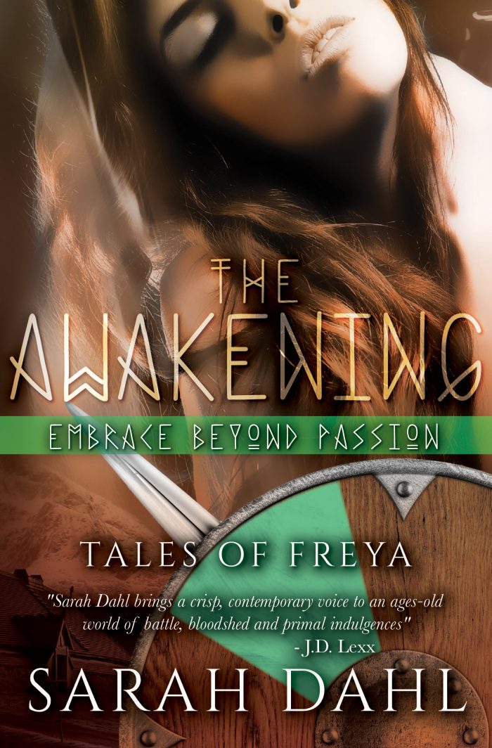
Cover reveal: “The Awakening – Embrace beyond Passion”
Today marks the reveal of the second cover in the series Tales of Freya: “The Awakening – Embrace beyond Passion” is now ready for preorders! 🙂 You can read an excerpt on my book page for it.
I’m so darn excited – it’s like the pre-battle rush of adrenaline … pheeeew, here goes:
Liberation begins in the mind …
“Ingrid leads a quiet, joyless life with a husband who is oblivious to her needs. Every time the dragon boats carry him away, she resigns herself to the solitude of her modest hilltop farm by the fjord. But her uneventful world is shaken to the core when the shadows of her house reveal a secret that sets her passions afire.”
The publication date is July 21st with all major and many smaller retailers.
And with this second cover, I thought it appropriate to reveal more than just the cover: The story behind it, and the other covers. How they originated and were developed. Why we did what we did, the brilliant Marisa-rose Shor and me.
First: The Tales of Freya are a collection of stand-alone short stories roughly around the 8000-word mark. The stories are not linked or have to be read in any specific order. I wrote them over a period of several years, and in each one I explore another topic of love, love-making, and what different aspects of sensuality can do with a life. Doing these explorations against the background of a long-gone era, early medieval Scandinavia – or: the VIKINGS – makes it extra fun and extra hard. Because I don’t use the era as mere stage-props (as I explained here).
Vikings are hot – but do them justice!
The term as such has a pull I wasn’t that aware of at first. But how often did I hear someone go “Vikings? Sensual Vikings? Omg! I want to read that!” There’s a certain image, however accurate or not, that seems to tie in wonderfully with something sensual, more primal. There’s a rough attraction to them. All the more difficult for me, their creator, to do them justice still and not exploit that too simply by making them a distorted version, cardboard heroes with little depth. There are so many “genres” now of all sorts of stereotypical hero-types being used over and over again to satisfy some hunger in readers for said fantasies of certain heroes. Highlanders, Tudor earls, Knights of all sorts. But I’m working hard to avoid too tiny pigeonholes.
I never use similar story arcs or characters. My stories start with an idea I want to explore. I don’t have a repeated plot line. Nor a certain type of he and she battling it out to then live happily ever after. I had different ideas I wanted to capture in the covers. Problem: for this many short stories, one cannot afford to have custom-made covers expressing said idea perfectly. 🙁
The goddess Freya covers all the topics
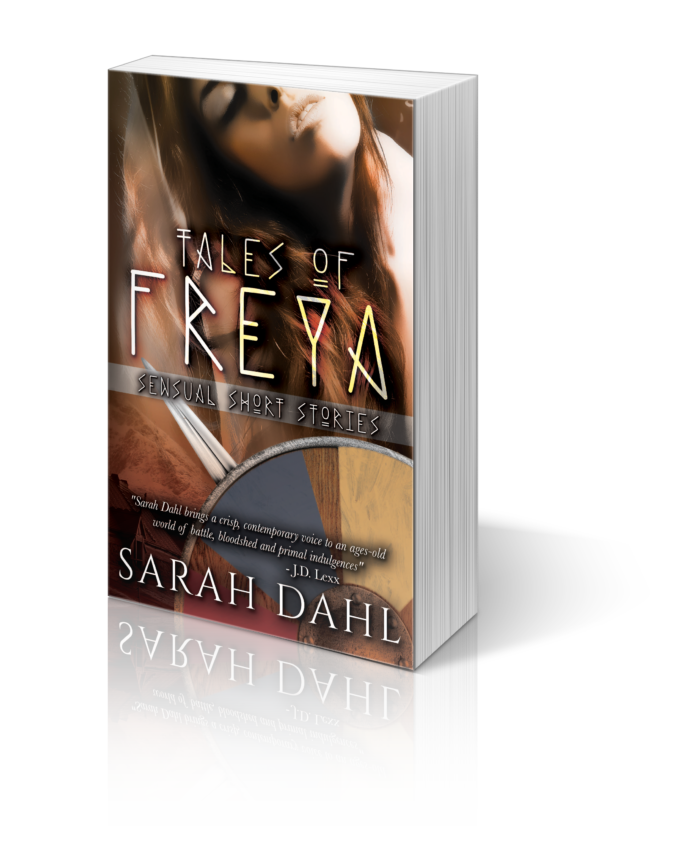
That’s how we, Marisa and me, came up with the idea of the Tales of Freya – and that woman on all the covers, and on the collection that contains them all as a paperback next year. The female image should represent the Viking goddess of love, lust, fertility and war: Freya, who covers just as many topics as my stories do. She ties it all together. There is a different plot line in every story; very different aspects of life and lust as I imagine them to have been back then. Then I went bold and sometimes pushed the theme to another level, using artistic freedom. But I always ensure historic accuracy (as much as possible, to not distort the plot or history’s realities) and have a network of people in place reminding me when I leave the paths of believability. The discussions we sometimes have are hilarious, as you can see here.
So my initial idea was to tie all the very different story plots together with the figure of the Viking goddess of love and lust, Freya. Marisa found the face and posture of a sensual woman that just fitted perfectly. She’s neither an object, nor offering herself. She’s a goddess, and looks as though she is enjoying her sensuality. In control, knowing her worth.
We tried to make her fit the historic genre, and my demand to be sensual but not too erotic. My stories are plot-driven and just happen to have steamy plots in which I carve out a deeper meaning. Always tasteful and elegant (I hope, and so far readers assure me: see reviews here).
Viking-ness as readers would recognise it
Next was the obvious: We needed typical Viking elements that do the stories and readers’ expectations justice. It has to be clear straight away where we are, and for what (Viking era/sensuality). Marisa is just brilliant at finding the perfect imagery AND make it hug the cover in a way that makes your eyes pop. The Viking longhouse, that beautiful, sleeping beast that is Borg on the Lofoten, is just iconic perfection. I want to run my hands over its perfect curves … and readers hopefully do the same with their eyes once the full-wrap paperback is out.
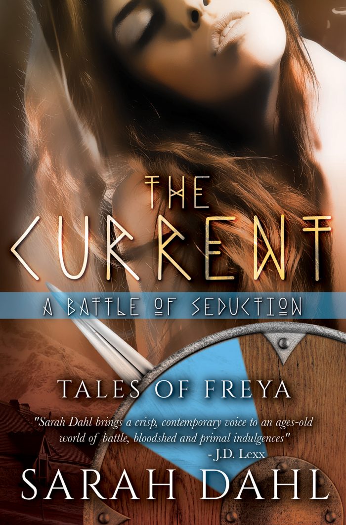
We also needed more popping imagery that fits the stereotypical Viking-ness and give some edge, as my stories are neither sweet nor romantic (much. Or are they? Maybe you should decide that). So there sure needed to be the typical, recognisable shield (again, perfect for the goddess of war) and a sword. Just because I am a sucker for a good Viking sword, AND the first in the series, “The Current – A Battle of Seduction“, features swords: I think I sneaked a sword or sax into every story 😉 PLUS the sword is my trademark in the logo and branding, too. 🙂
 And now we get to the interesting part. The image itself, the basic cover image, couldn’t change with every story (for consistency within the collection: readers should recognise a new story is part of that series of sensual shorts, and because of the final paperback that comes out next year, and plain financial reasons). So we had to resort to more subtle ways of bringing across the theme and differences between the stories.
Colour me meaningful
We needed a way to combine all the stories again, no matter how different they are, for the paperback. I will of course not reveal anything about the final paperback cover now. But we came up with colouring as one way to convey meaning, apart from the subtitles. So those are now highlighted by a coloured line that spans the whole cover and reappears in the shield to set each story off against the other. And for every story I chose a colour that fits the theme:
“The Current – A Battle of Seduction” is about a healing way to fight, and be swept away by the current, literally and metaphorically. So for this water theme we naturally used blue.
In the new book, “The Awakening – Embrace beyond Passion”, the young farmer’s wife Ingrid finds that liberation from the wrong life begins in the mind. It is about finding a new passion and the bravery to act on it, take risks to become happy. So for me, this new beginning and passion is well represented by the fresh green of spring (which also looks amazing paired with the different shades of brown of the rest of the book), a season of new beginnings and new life.
And the next story?!
Well, AFTER you read “The Awakening” there will be a cover with a more …
… purple theme. And what that means you will have to find out in early autumn 😉
How do you feel about covers and their message? Does the right cover say enough about a book for you to buy it? How do you plan your own covers? What role does imagery and colour play, you think? Tell us in the comments, I’d love to hear from you! 🙂
HAPPY READING & WRITING!


Comments (0)